UX Writer Certificate Final Project
I received my certificate through the UX Writers Collective in February of 2020
Featured Project
Background:
Fictional Handshake App Copy Design
Through out the course we used this fictional app to practice concepts we were learning. We developed parts of a style guide for voice and tone, learned to work with user personae, and eventually worked with the individual screens to edit using all of the concepts we’d learned.

Featured Project
Process:
Developing Voice and Tone
We were given two user personae, one representing the freelancer, the other representing the business owner. From these we developed a voice that would work for the app and in cases where needed modified the tone of the copy to fit a given situation.
We also were to develop a glossary of words and terms to use and those not to use. Early on I tossed out ‘business owner’. Freelancers are business owners, and who was to say that a freelancer couldn’t end up needing work done by another freelancer. For this reason I opted for freelancer and client as the two parties.
We also spent a little bit of time researching the market our fictional app would be entering. There are lots of options in the market but I decided that the value proposition for Handshake was in its ease of set up and use.
I used this to inform the decisions I made about the copy that I was to then edit.
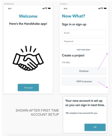
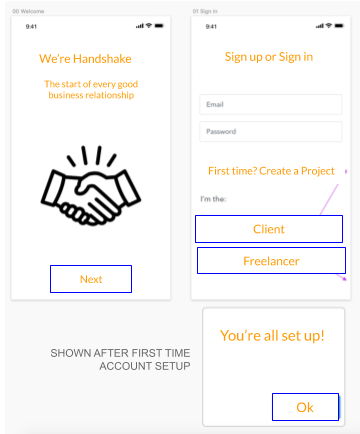
Onboarding:
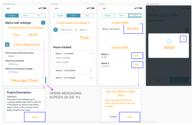
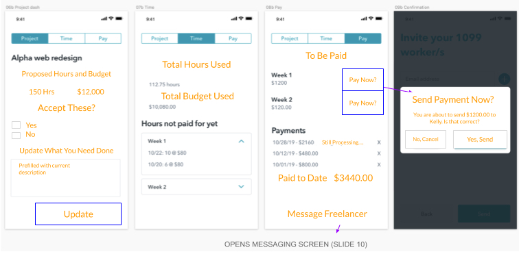
Note: All orange text on these screens are my edits.
The premise was that these were the mock ups from the UX designer, with her text. We were to make changes while respecting the space allotted for buttons and the like. We were also to note the need for any thing that was missing or confusing to produce as user friendly a design as possible.
I felt the voice should be friendly and encouraging. There should be as little business speak as possible.
The freelancer persona was younger, starting her own business as opposed to getting a job out of college. The client persona was older, an established business man but new to working with freelancers and concerned he was going to be paying for wasted time.
These would be the onboarding screens for the app. Both parties start here.
Ongoing Work:
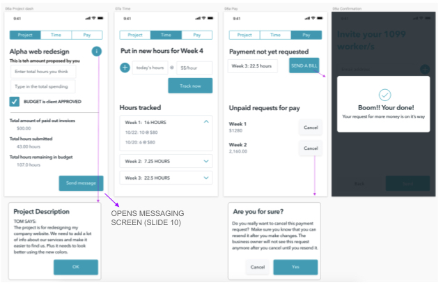
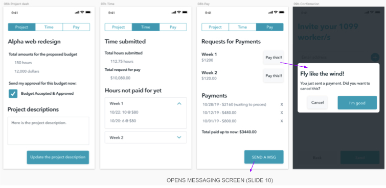
These screens are the ongoing flows for the freelancer (top two) and the client (bottom two) They are very similar in many ways and my edits emphasize that. Again, I was imagining that the freelancer could be the client at some point. I wanted them to have a sense of familiarity with what they were seeing.
Where ever possible I also tried to simplify the information being asked. If possible I also tried to arrange that information in a way that added white space to the screen so the user didn’t feel overwhelmed. This was directly tied to the idea that Handshake was simple to use.
These are also the screens where the parties deal with the money they would pay/receive for the work being done. A slight adjustment to tone was needed here, still friendly, still encouraging, but slightly more direct and serious.
The original screens were missing some information that needed to be added, which I was able to do on these.
Messaging:
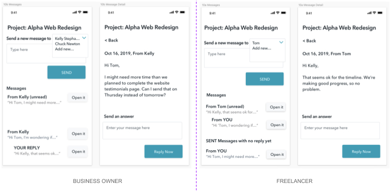
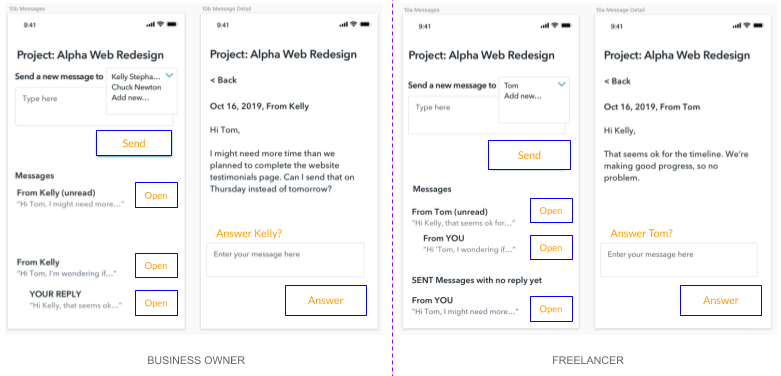
I felt like the messaging was the heart and soul of the app. Communication outside of your peer group is difficult, layer in they will be discussing money and that makes the situation even more stressful. This was a chance to use the app’s language to subtly remind each that they were dealing with someone, not just a business.
We reply to emails all the time. But we answer people.
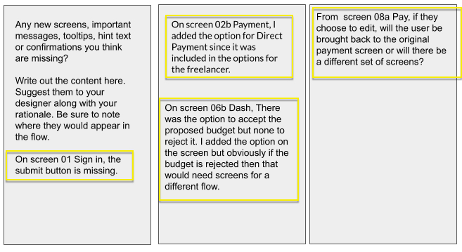
Notes to the designer:
There were more screens but for the sake of brevity I’ve only included these few. As the final part of the project we were to give notes back to the designer on items we thought could be added, or things we found missing. Here are my notes: